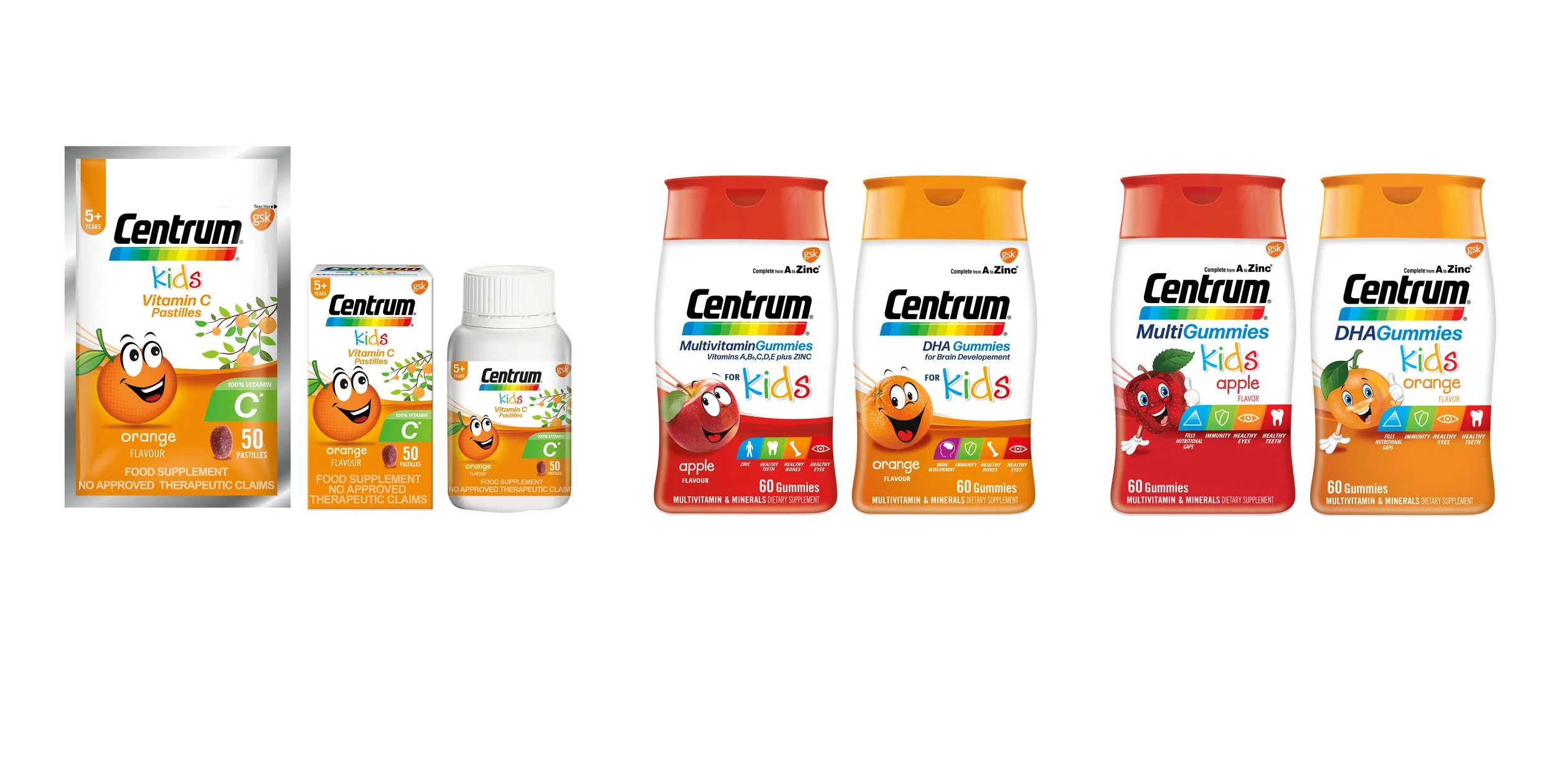
Centrum Philippines Kids Line Design
The Request
Centrum Philippines was launching a new Kids product line, based off the existing Scott’s packaging. The new Kids line needed to follow the established Centrum “Kids” look.
My Approach
I used Scott’s gummies as inspiration for the theme of the packs. Under the sea for DHA, and jungle for multivitamins. Vitamin C used an orange orchard theme. I followed Centrum Kids (USA) for design architecture. The lower arch color represents flavor. I explored a range of character illustrations and created a centralized area for the product benefits to simplify where the consumer needs to look. I adapted the final designs to all panels and created digital renders for online retailers.
What I Did
#Conceptual Sketching #Creative Concepting. #Concept Board Creation #Design Exploratory. #Comp Photo Retouching #Illustrtaion. #Icon Study. #Logo Study #Typographic Study. #Digital Market Place Renders
Current Scott’s kids lline
Illustration character study
Phase 1 design study
Final selected design
Selected design all panel layout


